
Reply to comment
Global Warming Policy Foundation graph in context
Tue, 24/07/2012 - 11:04 — dan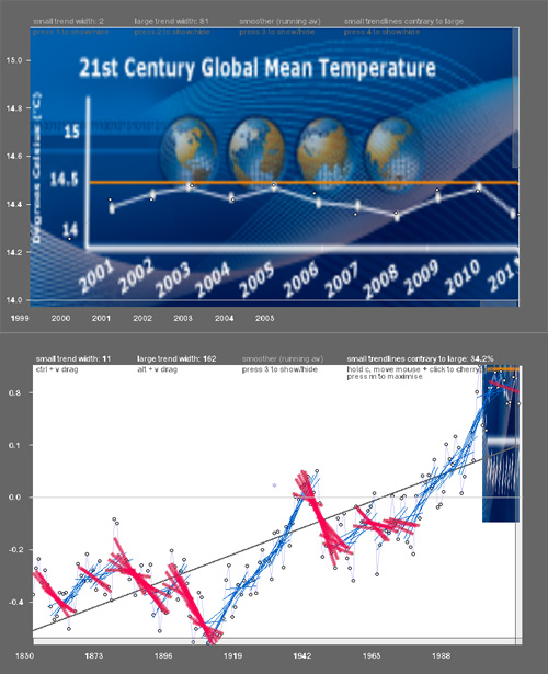
A while back I worked on a time series interaction tool for messing about with climate data. (It's a java applet, so you'll need java installed in your browser to see it; should look something like the pic in this post.) It isn't quite there - the keyboard controls (see 'controls' tab in link above) are clunky and unintuitive, it needs more direct click-and-drag.
But I thought I'd just share one fun part of it. First-off, here's the global warming policy foundation's front page. Note the top-left graphic (and here's a perma-copy in case they change it.)
Now, in the time series visualisation, click the 'GWPF' tab - you should see the first pic in this post. The tab's instructions provide you with links to see how the GWPF's graphic fits in with the dataset they're using (hadcrut3vgl, confirmed through email) - you can toggle between their graphic and the full dataset with the 'click here to toggle' link (or click on the graphic itself and use 'q' to toggle the view).
So does the 'story' they're telling with the graph hold out? Well, they don't say what that story is directly, of course - but it's implicit in the orange line at 14.5 degrees. An email from the GWPF confirmed it has 'no particular function' but emphasises that there's been an apparent 'warming standstill' since 2000.
In context of the whole dataset, that selection immediately looks rather odd, though, doesn't it? The eleven years of this century sit high, for the obvious reason that -
"including 2011, all eleven years of the 21st century so far (2001-2011) rank among the 13 warmest in the 132-year period of record. Only one year during the 20th century, 1998, was warmer than 2011"
Clicking the second link in the visualisation (to find the overall OLS trend) gives that some more context. The GWPF graph looks at 11 years. If you look at 11 year trends over the whole dataset, they go against the full trend 34.2% of the time - in just over one in three years. One of these covers the GWPF's data selection. Is there a 'warming standstill' every time that happens?
The answer depends on what we know about the physical system, and what the forcings are. This is a point I was trying to make with the first two tabs (the cell 1 and 2) using daily temperature data from York University Electronic Department's weather station archive. Skipping to 'the cell (2)', you can do the same thing (alt + vertical drag) to get an intuitive sense of where the seasonal 'signal' appears out of the noise: it shows both the OLS trendlines starting from each datapoint, and points showing the polarity of the trendlines (the 'smoother'). Dragging will get you from apparently random day-to-day noise to the seasonal temperature curve. The size of the trend width appears on the top bar.
This sort of kinetic understanding is something I find useful for myself: seeing that an ordinary least squares calculation can clearly pick out the seasonal signal at the right trend, and seeing how going under or over a certain value either moves towards noise or towards a less clear seasonal pattern (until at the extreme, a single trendline appears to have a positive slope over four years of York data... )
Compare that to the GWPF approach: you get a very clear season 'signal' at about 180 days (to eyeball - this is not robust of course!) At that width, you get counter-trends happening at about 34% if they're 22 days long. (Use the large trend for 180 day width and the small trend, CRTL+drag, for the 22 days. Small counter to large % appears top-right.)
So by the GWPF's logic, would it be 'season standstill' every time a 22 day stretch went against the seasonal trend? No, of course not. This is a point made many times by others (most amusingly by Realclimate.org) The mysterious correlation between amount of sunshine falling in York and the average temperature is no mystery at all: the regional climate is being 'forced' by the sun's energy. Regional seasons are a quite complex process (e.g. the sun's energy arrives in pulses as the Earth spins every day), yet we get this extremely regular aggregate property: a clear temperature sine-wave over the year.
Co2 forcing is in some ways even more straightforward: more energy will continue to enter the atmosphere as long as we carry on adding the stuff - and then for some good while afterwards. Quite how long depends on what other processes come into play. That's the really fun stuff, and the most uncertain. But the link between energy imbalance, re-equilibriating and temperature change is as robust as the seasons.
Using too short a trend is meaningless. Making strong claims about standstill based on too short a trend is ignorant, wilfully or otherwise.
Any views on whether the viz tool works or not gratefully received. As I say, better controls = No 1 thing to do.
Recent comments
21 weeks 6 days ago
2 years 12 weeks ago
2 years 12 weeks ago
2 years 14 weeks ago
2 years 15 weeks ago
2 years 15 weeks ago
3 years 12 weeks ago
3 years 36 weeks ago
3 years 36 weeks ago
3 years 38 weeks ago